With the recent push towards businesses embracing responsive design, I often see myself looking at these new cutting edge websites and wondering about the big screen?
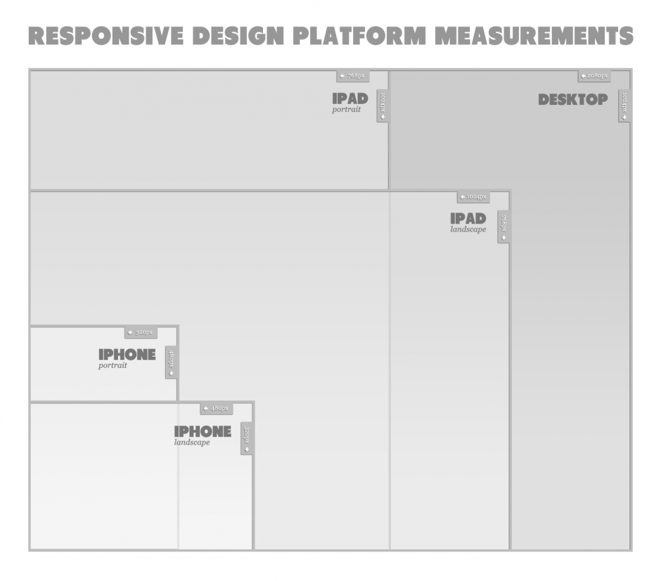
Standard responsive design currently tackles 4 major screen sizes, with them being in very simple terms, desktop, horizontal tablet, vertical table and mobile. But the reality is, how many users really fit within the 2 tablet sizes and how much does all this extra design work, really benefit the experience?
With the largest size usually featured in responsive websites being that of around 1000px wide, wouldn’t it be better to shift your attention to the users that are on today’s reasonably priced, oversize screens? What about looking at replacing the horizontal tablet screen size with a 1300px to 1400px wide resolution, or alternatively just adding in a 5th size.
With all businesses that I have worked across, analytics clearly show that the biggest percentage of users, have a screen size well over the standard 1024 x 768 resolution, so wouldn’t focusing a bit of attention on these users, help maximise eCommerce returns and really change the user experience for those people still shopping from their desktop? While the shift towards mobile is well and truly here, lets not forget the fact that standard screen size resolution is on the rise and its important to find a balance between optimising the mobile and desktop experience. There seems no reason to me why businesses can’t have the best of both worlds.